Mochi Health

Mochi Health is a physician-founded, San Francisco-based healthtech company that is transforming the landscape of obesity medicine. As part of this mission to empower patients, I was tasked with designing a Weight Tracker Mobile Application. The goal was to move beyond simple data entry and create a tool that visualizes progress and celebrates 'small wins,' aligning with Mochi's philosophy that small moments of joy lead to big transformations.
Basic Information:
My Role
UX Designer
Project Duration
3 days
Tools Used
Figma
Project Overview:
General Info
A 3-day take-home assignment as part of the interview process for a Product Designer role.
Mission
Empower patients to manage their metabolic health through clinical support and transparency.
Deliverables
User Research;
Wireframes
High-Fidelity Mockups & Prototype
72-hour Design Process

Problem Discovery
Understand the current problem, align with business goals and user needs, review product requirements, and identify key stakeholders.
1
Research & Ideate
Gather insights through user research (competitive analysis & user interviews) and translate them into design decisions.
2
Deliverable
-
Wireframe
-
Design System
-
High-fidelity
-
Mockup
3

Problem Discovery
Project Prompt:
Mochi Health is looking for a weight tracker feature that enhances user motivation, increases retention, and encourages habit formation.
Challenge:
How might we help users who are on a weight loss journey effectively track their progress, stay motivated, and build long-term healthy habits?
Data:
64%
of American adults will be overweight or obese by 2025, according to the CDC
49.1%
of U.S. adults tried to lose weight in the last 12 months,
according to the CDC
30%
more successful weight loss outcomes can be achieved through strategies like goal-setting and visual feedback, according to the American Psychological Association

The Problem
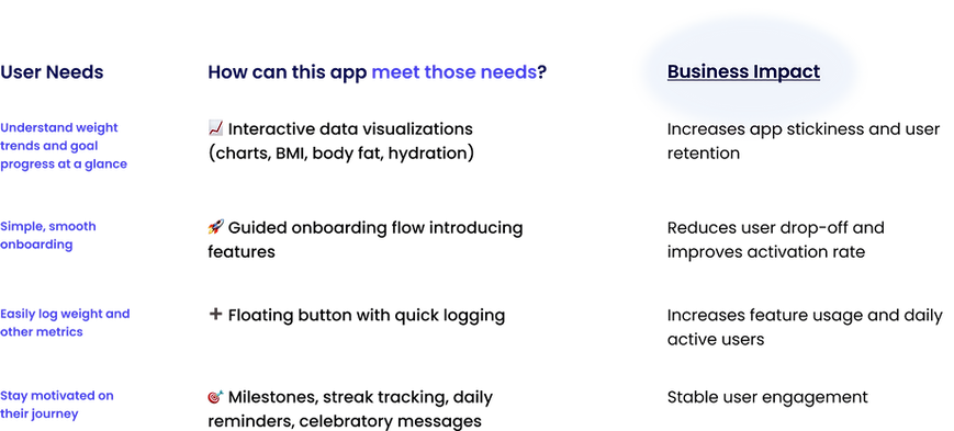
Lack Interactive Visualizations
Difficult to Understand How to Use the Product Effectively
Most weight tracking tools are
fragmented, hard to stay engaged with,
offer poor onboarding, and unclear visual progress tracker.
Buried Feature
Missing Body Composition Insights (e.g., BMI, body fat)
Unclear Onboarding
Research:
Uncover Weakness and Identify Best Practices
I utilized Competitive Analysis & Swot Analysis to identify best practices in the industry that can be adopted and highlight unique features and strengths, making it easier to communicate our value proposition to potential users.

Conducted 6 user interviews with target users to understand user pain points and needs:

Now for the fun part... the design! 🎨
%201%20(1).png)
Onboarding
_edited.png)
Feature #1
Quick Introductory Pages
Three concise pages highlight our core offerings, reassuring them they’re in the right place.
Feature #3
Entirely Skippable Account Setup
We understand that not every user wants to commit right away.
Feature #2
Progress Tracker
Provides clarity on progress, reducing uncertainty and encouraging users to complete.
_edited.png)
Home
Reminder banner
Visualize Progress at a Glance
Key Stats
Floating button with quick logging
Encourages consistent logging
Shows weight lost and progress toward goal
Displays starting weight, current weight, and target weight, where all values are editable, giving users control and flexibility over their data
_edited.png)
Visualization
Interactive Progress Graph
Displays a line chart of weight changes across a selected time frame (Month, Week, Year).
Switch Between Metrics
Track between Weight, BMI, and Body Fat %
Hydration Tracker
Log daily water intake and reinforce positive daily habits

_edited.png)
Streak
Feature #1
Calendar-Based Streak Tracker
Marks daily weight log entries and highlights days with measurable progress toward the goal, offering a motivating visual representation of achievement.
Feature #2
AI Summary
Displays current and longest streaks, along with overall progress to motivate continued engagement.
Account
_edited.png)
Feature #1
Centralized Profile Management:
Centralized Profile Management:
Feature #2
Customization
Users provide key metrics (height, starting weight, and goal weight) which the app uses to calculate progress milestones and weeks remaining.
Feature #3
Tutorial Pop-up Window
Guides users with a clear step indicator, a close icon for flexibility, and emojis for quick understanding
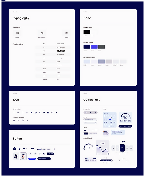
Design
System
Incorporated Mochi Health’s existing branding elements, including the color palette, typography, logo, and gradients, based on both the website and mobile application to maintain visual and brand consistency.

If I had more time, I want to...
Conduct Usability Testing
Through testing, I hope to gather feedback on the data visualization section, specifically whether users find the graphs easy to understand, how they interact with the three available tabs, and if there are additional metrics they would like to see displayed.
Design Calories and Sleep Tracker
Tracking calories helps users stay within their target intake and make informed food choices to support weight loss. Monitoring sleep can directly impact metabolism, cravings, and overall progress. Designing these two features can give users a more comprehensive view of their habits, helping them make smarter, long-term changes beyond just tracking weight.
Reflections & Next Steps
Outcome
This 3-day challenge resulted in a successful submission that met all stakeholder criteria and secured my advancement to the next stage of the interview process at Mochi Health.