
Scout Motors, revived by Volkswagen Group, builds rugged extended range EV trucks and SUVs inspired by the classic International Harvester Scout back in 1960-1980. Designed for off-road adventure, Scout Motors aims to blend nostalgic aesthetics with a modern twist.
Disclaimer: The work presented in this case study was created as part of a capstone collaboration between the University of Michigan School of Information and Scout Motors.
.png)
Basic Information:
Project Type
My Role
University of Michigan Capstone Project
Report to Design Lead @Scout Motor
UX Designer
Project Duration
5 Months
Team
1 PM
4 Product Designers
Tools Used
Figma
Product Video:
Problem Discovery
How might we design central display controls for Scout Motors’ vehicles that seamlessly balance tactile buttons and digital interfaces while enabling shared access between the driver and front passenger, enhancing hands-on driving in all kinds of conditions (including off-road), and aligning with Scout Motor’s brand legacy of rugged utility and innovation?
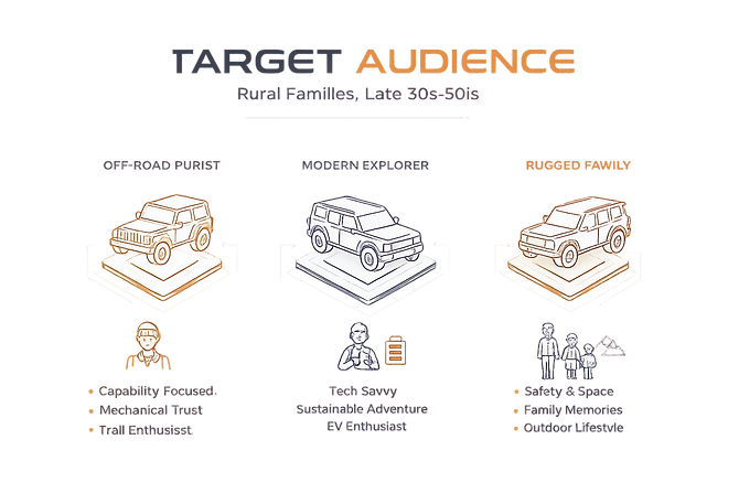
Where Rugged Legacy Meets Electrification
Whom is this vehicle built for?
Design Process

Market Research:
HMI Landscape & In-Vehicle Interaction Benchmarking
We conducted an in-depth analysis of six competitors by synthesizing data from official manufacturer specifications, enthusiast forums, and first-person (POV) user reviews.
Research Scope


What user experience and information do Scout Motors' competitors deliver through their central displays and physical buttons?
Evaluation Criteria:
Central Display Criteria:
-
Screen Size, Type, and Orientation
-
Infotainment System
-
Navigation
-
Display Customization
-
Split-Screen Options
-
Off-Road Features
-
Electric-Specific Data
-
Shortcuts Bar & Status Bar
-
Best-Use Case Scenarios
Physical Buttons Criteria:
-
Physical Buttons’ Functionalities
-
Volume & Audio Controls
-
Climate Control
-
Drive Mode Selector
-
Off-road Controls
-
Towing Controls


What This Means for
Scout’s Product Direction
Tradition vs. Innovation in Vehicle Design
Off-Road Adventure Vehicles (e.g., Ford Bronco, GMC Hummer EV) prioritize rugged capabilities and physical controls, whereas modern high-tech adventure vehicles blend off-road capability with a sleek, futuristic interior, focusing on digital interfaces and advanced connectivity.
1

Off-Road Navigation
Half of the brands/models we researched do not offer dedicated off-road maps or trail planning features. Integrating topographic maps, trail tracking, and trip planning could significantly enhance the user experience.
2
Spilt-Screen Design
Split-Screen design, in which touchscreens can be divided into two or more separate screens, is very common. This design allows users to view and interact with multiple pieces of information simultaneously.
3


What Users Expect Every Time They Start the Engine
Low Cognitive Load While Driving
Users need a system that allows quick adjustments without visual distraction. Controls must be operable with minimal glance time to maintain situational awareness.
Immediate Access to Essential Controls
Critical functions such as climate, drive modes, and media require tactile access through well-positioned physical buttons or knobs.
Driver-First, Passenger-Aware Design
The driver remains the primary control authority. The passenger should be able to interact intuitively without interfering with driving safety.
Adaptive Interface
The system must feel intuitive from first use, while still allowing customization for different driving contexts including daily commute and off-road scenarios.
Minimal Learning Curve
Users expect a straightforward interaction model that works immediately, regardless of technical familiarity.
User Needs
Maintain Control in All Driving Conditions
Clear visibility, accessible controls, and high readability are essential across urban, highway, and off-road environments.
Balance Digital Innovation with Physical Confidence
Users seek modern digital capabilities while retaining tactile feedback that builds trust and control.
Seamless Context Switching
The interface must adapt smoothly between navigation, performance monitoring, terrain data, and entertainment without overwhelming the user.
Support Both Daily Utility and Adventure
The system should enhance routine driving while scaling up for exploration and rugged use cases.
Enable Shared Experiences
Integrated features should support collaboration between driver and passenger.
User Goal
Ideate:
Exploring 3 Design Directions
Grounded in market research, user personas, and client conversations, we translated key user needs into three differentiated concept directions. Each concept represents a different interpretation of the same core user needs, ranging from tactile-first rugged control to software-forward minimalism.
Concept 1 — Rugged & Analog: Control-First. Terrain-Ready.
.png)
Design
Philosophy
Prioritizes physical confidence and mechanical reliability for off-road dominance.
Physical-Forward Architecture
-
All critical off-road functions are integrated as physical buttons, ensuring quick and reliable adjustments in rugged outdoor conditions.
-
Large, glove-friendly buttons and rotary dials
-
Digital layer supports refinement, not primary control

Concept 2 — Retro-Modern: Heritage Meets Smart Utility.

Design
Philosophy
Honors Scout’s rugged legacy while delivering hands-on experience for both daily driving and off-road adventures.
Selective Physical Interaction
-
Physical interactions are designed for climate control and off-road related tasks that are critical and need immediate action from the driver and passenger.
Concept 3 — Urban & Futuristic: Digital-Forward. Customizable. Minimal.

Design
Philosophy
Software-led experience with minimal hardware dependency and advanced interaction paradigms.
Minimal Physical Controls
-
Only the most essential buttons remain physical, ensuring that critical functions are always easily accessible. This design enhances the vehicle's modern aesthetic and improves user interaction through touch and voice controls.
Concept Evaluation & Validation:
Internal Evaluation & Usability Studies
To determine the strongest direction, we conducted an internal evaluation with stakeholders and validated the concepts through targeted user interviews. We collaborated with the client team to review trade-offs and alignment with Scout’s brand vision.
Each concept was assessed across four strategic dimensions:
-
Control Accessibility
-
User Experience
-
EV Integration
-
Off-Road Capability

We recruited drivers aged 20–30 who regularly drive SUVs or pickup trucks. Participants completed in-person testing to simulate realistic interaction with the interface concepts.
Research Objectives
-
Determine which concept best aligns with user expectations
-
Evaluate usability, efficiency, and intuitiveness
-
Understand layout preferences and interaction clarity
-
Identify high-value features and potential gaps
1
Evaluation Approach (mixed-method)
-
Quantitative Metrics: Task success rate, Completion time, Usability rating (Likert scale)
-
Qualitative Insights: Observed interaction patterns, Verbal feedback, Friction points and hesitation moments
2
Key Findings & Decision Rationale:


Based on stakeholder alignment and user validation,
Concept 2 — Retro-Modern was selected.

But we also discovered some areas of improvements:
While Concept 2 emerged as the strongest direction, user feedback highlighted opportunities to reduce visual complexity and improve interaction clarity.
Users found some icons unclear or confusing
💡
Using intuitive, easy-to-understand icons to minimize confusion
1
Users prefer having one clear primary interaction method
💡
Avoid competing interaction patterns to reduce cognitive load
2
Dual-screen usage is very preferred
💡
Design should support multi-tasking without becoming overwhelming
3
A low learning curve is important to users
💡
Interface should feel familiar and easy to use right away
4
Example: Transforming the idea of Music Floating Window

What Participants Liked
Music is a high-frequency interaction. They prefer having it in a consistent on-screen location.
It should not require entering multiple layers of navigation or need to dominate the primary driving canvas
The Tension That Emerged:
Disruption of the glance path
However, one participant surfaced an important concern.
The music window sat on top of the map and functioned as a layered overlay, rather than an integrated system element.
Music Floating Window
Instead of keeping the media control as a floating overlay, I repositioned it into the bottom status bar, which transformed the music control from a layered element into a system-integrated component.

We refined the layout structure, clarified control hierarchy, and optimized high-frequency actions before translating the wireframes into a high-fidelity interactive prototype.
Here is the finalized High-Fi Prototype ready for a second round of usability testing to validate improvements and ensure alignment with user expectations:

Design Iteration:
Final Usability Testing & Iteration
After refining the high-fidelity prototype based on initial feedback, we conducted a final round of usability testing to validate improvements and identify remaining friction points.
-
6 participants
-
60-75 minutes sessions
-
1 facilitator + 1 note taker
-
Onsite sessions
-
6 core interaction tasks
Overall Satisfaction: 4.25 / 5
Testing Overview

Several interactions achieved a 100% task completion rate with positive feedback:
-
Switching between navigation and music via the left shortcut bar
-
Discovering and using the music shortcut
-
Swapping split-screen content
What Worked Well
In addition to strong task completion rates, usability testing revealed a few areas where users hesitated or misinterpreted system behavior. We refined the design accordingly to improve clarity and reduce ambiguity.
- Closing Split-Screen Flexibility

- Redesigning the Change App Icon

- Split-Screen App Hub Consistency

- Split-Screen Icon Clarity

Final Product:
High-Fidelity Prototype
Disclaimer: The work presented in this case study was created as part of a capstone collaboration between the University of Michigan School of Information and Scout Motors. All concepts and design explorations are academic in nature and do not represent Scout Motors’ official products, strategies, or final design outcomes.
Within the final selected direction, I led the design of the split-screen interaction model, navigation system, music interface, phone tab, and typography system. I was responsible for defining the layout structure, interaction logic, and visual hierarchy across these key modules.
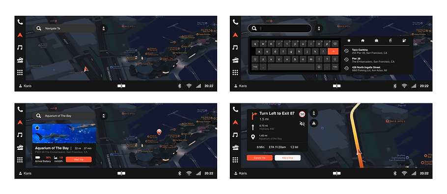
Navigation Tab

Music Tab

App Hub & Phone

Split-Screen Interaction Walkthrough